
OEE software
OEE your operators don’t have to feed
ThingConnect reads machine state, part counts and cycle times straight off the CNC controller, then shows you exactly where the hours went: availability, performance and quality, with the arithmetic on screen.
Purpose-built for machines controller-native cloud-first
All time → fully productive.
 Tap to zoom
The week at a glance
Six numbers, each one traceable to a machine
Every tile carries the hours it cost, not just a percentage. Each one compares against the previous period, so you can tell a bad week from a bad habit.
The problem
Why OEE numbers usually can't be trusted
- Availability comes from a logbook filled in at 5:55 PM, from memory.
- Micro-stops never get recorded, so the four-minute stops that add up to an hour a shift stay invisible.
- The spreadsheet takes a day to compile, so the loss is a week old before anyone sees it.
- Every department calculates OEE differently, so the meeting argues about the number instead of the loss.
Where the hours went
Every hour of the week lands in exactly one bucket
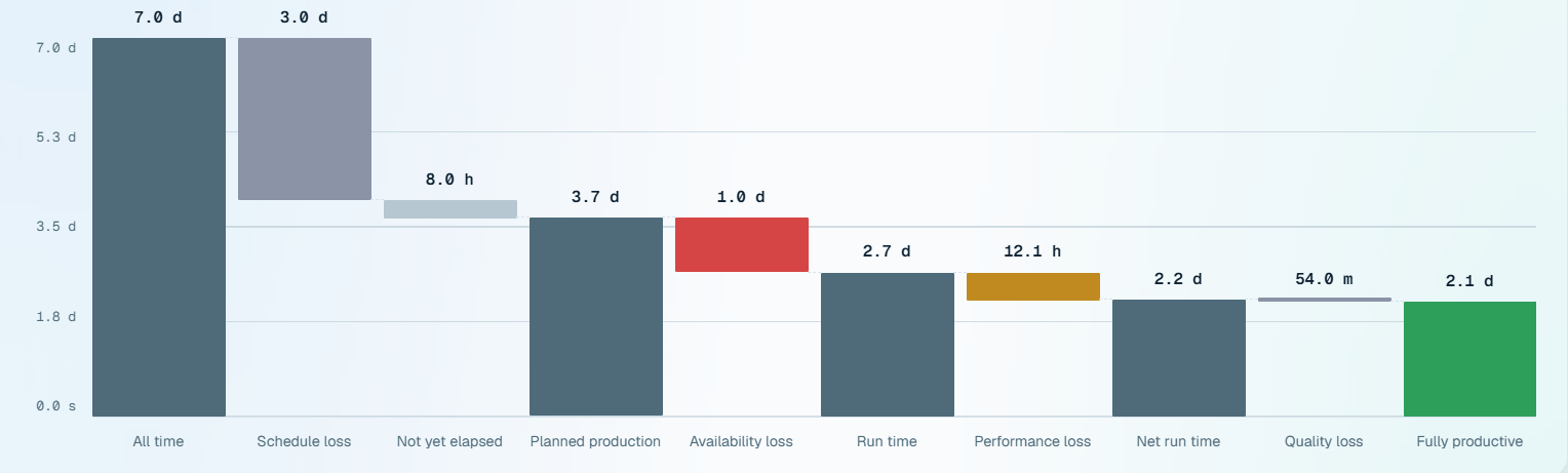
OEE as a single percentage tells you there is a problem. The loss tree tells you which hours caused it. Read it left to right: calendar time narrows, one loss at a time, down to the hours that actually produced good parts at rate.
The arithmetic closes
All time splits into schedule loss, not-yet-elapsed and planned production, and each loss below is carved out of the step above it. Nothing is left unaccounted for, so nobody can ask “where did the other four hours go?”
Hours that haven't happened aren't losses
Ask most tools for week-to-date OEE on a Saturday morning and the shift still to come gets charged against you. We hold it in its own bucket. Nothing has gone wrong there. The outcome simply isn't known yet.
Availability loss opens the report behind it
The downtime report opens on the same window, the same machines and the same shift, so the biggest bucket on the tree stops being a dead end.
The three factors
A × P × Q, shown separately and sourced separately
A single OEE figure hides which factor is hurting. Each is shown on its own with the hours it cost, because the multiplication means your worst factor dominates the result.
Read from the controller's own run state, not from classified downtime, so an alarm during otherwise-running execution still counts as a stop, the way the operator experienced it.
Measured against the engineered cycle time for the part actually running, never a target somebody typed in. Multi-up fixtures are handled properly: a four-up fixture yields four parts per cycle, not one.
Good parts over parts produced, from real reject counts logged against the same window the parts were counted in. Never a different window, and never assumed to be 100%.
Lunch breaks, shift handovers, planned maintenance and changeovers count against availability the way your plant decides. The definitions are set once, applied everywhere, and printed on every report.
Machine detail
One machine, one window, read two ways
Open any machine and the same week resolves into two questions: which loss is actually the big one, and what the machine was doing with the hours it was scheduled for.
- Availability24.2 h · 65%
- Performance12.1 h · 33%
- Quality0.9 h · 2%
Which machine
Worst first, because a ranking exists to be acted on
The same scope, broken out per machine, sorted by the machine dragging hardest. Column headers don’t re-sort it. A ranking you can silently re-order isn’t a ranking.
| Machine | OEE | AAvailability | PPerformance | QQuality | ||
|---|---|---|---|---|---|---|
| VMC-2 | 41.8% | 61.2% | 70.9% | 96.4% | 6.8 h | 4.2 h |
| HMC-1 | 52.3% | 69.4% | 77.2% | 97.6% | 5.4 h | 3.3 h |
| VMC-1 | 58.6% | 74.1% | 80.4% | 98.3% | 4.6 h | 2.7 h |
| HMC-2 | 66.9% | 79.8% | 85.6% | 97.9% | 3.4 h | 1.9 h |
| Turning cell 3 | — | 77.3% | — | 100.0% | 4.0 h | — |
Where most tools guess
When there’s no engineered standard to judge a machine against, ThingConnect shows a dash, not a zero.
A fabricated 0% looks like a failure. It sends a supervisor to a machine that is running perfectly well against a cycle time nobody ever set. So performance and OEE come back blank, captioned Not planned, until there’s a real standard to compare against. Availability and quality never depend on that mapping and are always real numbers.
The same rule holds when machines are pooled. A machine with no standard is left out of the plant-wide figure entirely, rather than padding a numerator it never contributed a denominator to.
One click deeper
Availability loss opens the reasons behind it
The 24.2 hours in the red bar aren’t the answer. They’re the question. Clicking through carries your window, machines and shift into the downtime report, where every stop is ranked by the time it actually cost.
One implementation
One number. Every screen.
The shop-floor board, the machine drill-down, the production report, the part history and the loss tree all call the same calculation. They cannot disagree about a shift, because there is only one place the answer comes from.
Operators see the gap while it can still close
Shift OEE updates as parts drop, on a board sized for the floor and a timeline wall that shows the shift as it happened.
Supervisors see which machine to stand next to
A by-day trend, and a per-machine table ranked worst OEE first, because a ranking exists to be acted on rather than admired.
Managers attack the right loss
The loss tree in hours, compared against the prior period, so improvement work is aimed at the biggest bucket rather than the loudest complaint.
Built for real shift patterns
Your plant's calendar, not the software's
Most OEE tools quietly assume a day starts at midnight. Almost no plant works that way, and every report is wrong by one shift until it’s fixed.
Your start-of-day
Set the boundary to 06:00 and 03:00 still belongs to yesterday, because last night's shift hasn't finished its day yet. Today, this week and this month all follow that rule.
Overnight shifts land on the right date
A Saturday third shift running into Sunday morning reports as Saturday's shift, the way it was scheduled and the way your supervisor talks about it.
Your timezone, your breaks
Every screen renders in the plant's configured timezone rather than the viewer's laptop, and scheduled breaks are recognised as planned stops without anyone classifying them.
Questions
Before you book a demo
As availability × performance × quality. Availability and performance come from controller data (run state, cycle times, part counts); quality comes from good/reject counts entered by operators or read from the control where available. Each component is shown separately so the number is auditable.
Yes, that is a core feature. Planned maintenance, lunch breaks, shift handovers, trial runs, and changeovers are classified per your plant's rules, configured during deployment and adjustable later by your admin.
Not for availability and performance. Those are read from the controller automatically. Operators only classify downtime reasons (two taps) and enter reject counts where the control can't report them.
It flows encrypted to your own ThingConnect cloud workspace, visible only to your accounts, exportable anytime, never aggregated across customers. Plants with strict data policies can deploy fully on-premise as an enterprise option.
See it on your machines
A 30-minute call, your controllers, your shift pattern, and the loss tree above filled in with your own week.